Assignment 6 « Data Visualization »
Due: 11:59pm March 27, 2021 (ET)
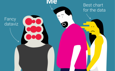
Bad Data Viz can be found everywhere. So, please let us indulge by listing just a few examples here:
Overview
In this assignment, you will use D3, an interactive visualization library, to develop your own data dashboard. D3 is extremely powerful and can be used to make very specific, informative diagrams. We highly recommend that you complete the D3 + JavaScript lab before you attempt this assignment. We have a ton of explanation and introduction to D3 in the lab.
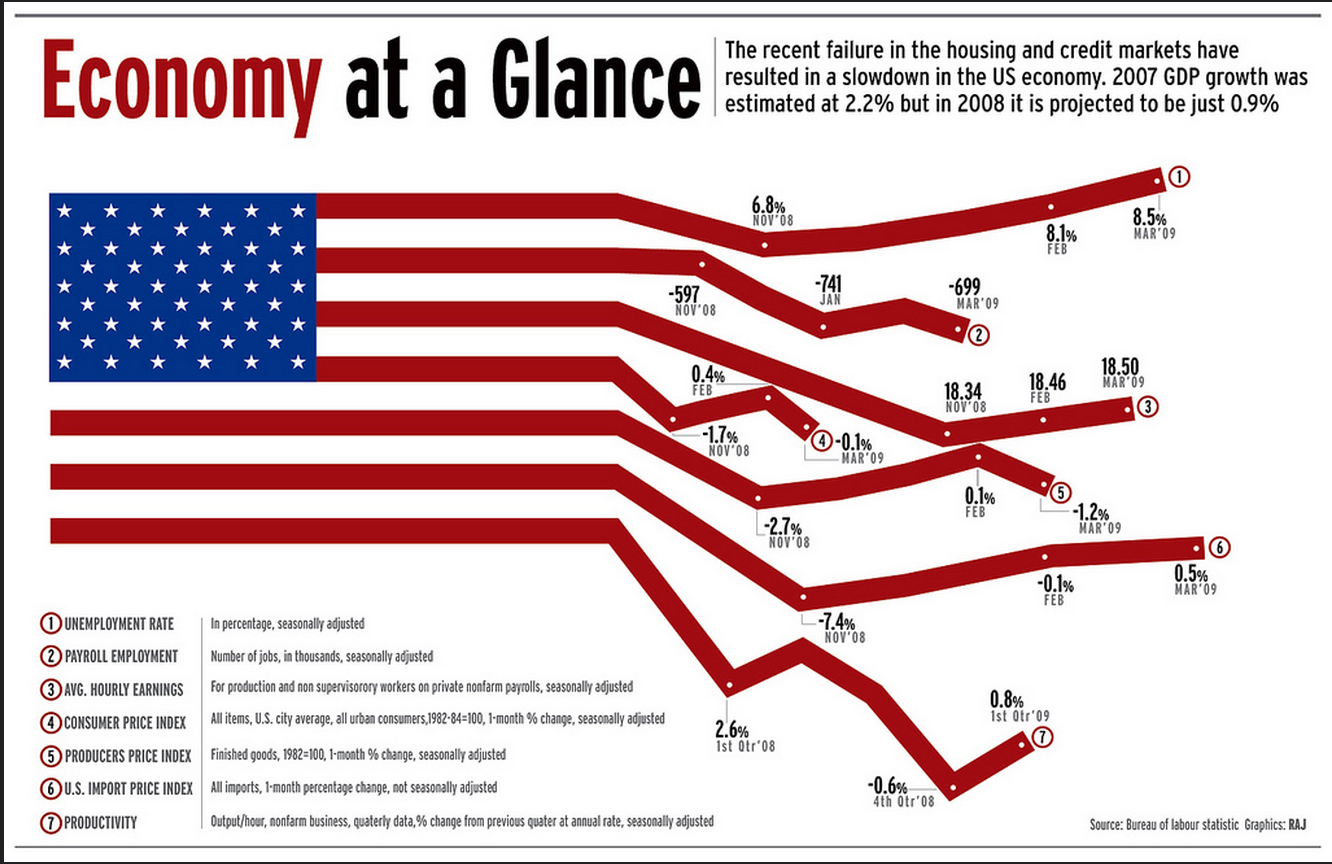
To illustrate the capabilities of D3, here are some stunning examples of visualizations created with it:
We know that D3 code is easy to find online. Even if we provide you with reference implementations, do not copy any code.
Before you begin
Do the Intro to Viz Lab!
Many students find this assignment to be one of the most challenging in the class. This is because JavaScript is a new language and framework for many, and we don't formally teach it. We HIGHLY recommend you walk through the Data Visualization lab listed here before you begin.
Since this project is more free-form than previous assignment, there is no solution code for this assignment. We will do our best to debug your dashboard during TA hours, but TAs at hours can only be so helpful debugging your particular project. A few tips:
- Start early!
- Do/review the D3 lab and refer to the solution code for part 2 for certain features (i.e. colors, tooltips, etc.)
- Look for resources online (DO NOT COPY!) and do your best
Accessible Data Visualization
Before you start designing your dashboard, read
- “Why Accessibility Is at the Heart of Data Visualization,” paying particular attention to the “Design equivalent experiences for all your readers” section.
- “A Comprehensive Guide to Accessible Data Visualization,” which provides specific suggestions to make data visualizations accessible to people with visual impairments.
We hope for some this will be a fun assignment and closely resemble future data science work!
Setting Up
Getting the Stencil
You can click here to get the stencil code for Homework 4. Reference this guide for more information about Github and Github Classroom.
The only stencil requirement that we have is that your code must consist of index.html, main.js, main.css, and relevant files.
Please refer to the submission section of this handout for submission specifications.
Run Specifications
To view your visualization in the browser, we're going to load the webpage via a local web server. Navigate
to the directory containing your index.html file, and run
python3 -m http.server 8000
You then can open a browser to the url http://localhost:8000/index.html to view your
dashboard.
If you are using the department machine to code and run your python server, you can refer to this instruction to learn how to view your product locally.
Assignment
Your task is to create your own informative D3 dashboard! This assignment, in particular, is very flexible. There are no strictly correct or incorrect answers since visualization is inherently subjective. That said, we will evaluate your work on a number of requirements listed below. Further, we expect that you incorporate concepts that Lorenzo has discussed in class like color palettes, font types/sizing, orientation, clarity, organization, and informativeness.
Dashboard
68 points
Datasets
(5 points! Just for using the right data...)
You must use data from one of the following datasets. Each dataset has a series of leading questions you may use as inspiration. You should make sure that your dashboard answers these questions. Imagine your boss gives you 2 weeks to build a dashboard on these issues.
Note: All 3 datasets are provided in the data directory. Each topic includes a link to a Kaggle site with more information about the dataset.
-
Video Game Sales | Kaggle
Questions:
- Your boss wants to know the top 10 video games of all time or top 10 for a specific year.
- Your boss wants to understand which genre is most popular. We'd like to see genre sales broken out per region. (This question can be answered by showing the top genre in each region if you want to implement a map, otherwise you should show genre sales broken down by region in bar/scatter/line/pie etc.)
- Lastly, your boss wants to know which publisher to pick based on which genre a game is. Your chart should provide a clear top publisher for each genre (could be interactive or statically show).
-
International Football Results | Kaggle
Questions:
- Your boss wants to know the number of football games by year. You should show at minimum 5 years, but you can choose which years to show.
- Your boss wants to understand the top winning nations. We would like to see a winning percentage for the top 10 nations. You can show this in a map form if you would like to.
- Lastly, we are trying to bet on which team will win the world cup 2022. Over the last 2 world cups, which teams were top performing. You can decide how to interpret "top performing". A few approaches we would reccomend: winning percentage in the world cup, victory strength, strength of opponent. You may show any combination of those. We don't have a specific answer we expect, and you should explain your choice in the written questions.
-
Neflix Collection | Kaggle
Questions:
- Your boss wants to know the number of titles per genre on Netflix.
- Your boss wants to understand the average runtime of movies by release year.
- Lastly, we want to learn about the cast and directors. You have two choices here: 1) the top director + actor pairs by number of movies made 2) a flow chart where each actor is a node, and a link refers to a movie they both acted in (just the connection, no need to specify number of movies made together or which movies those are)
Dashboard Requirements
Please put your dashboard in index.html with your JavaScript D3 code in main.js
and any custom styling in main.css. Feel free to add new JavaScript files if you want.
Graph Structure
(35 points)
- You must have 3 graphs (10 points each)
- There must be 2 unique graphs (5 points)
Unique graphs are bar, line, scatter plot, heatmap, density, area, etc. You can see examples here. In our stencil we have setup three boxes for you to place your graphs, but you can feel free to adjust these based on your graph selection.
Interactivity
(10 points)
-
You must have 1 filter/toggle/interactive element of your dashboard. (5 points)
We define this as a clickable/writeable element that updates the graphs/look of the dashboard.
-
You must have 1 tooltip for a graph on your dashboard. (5 points)
We define this as information which appears when users hover over a data point‐ this can be combined with your clickable element, but a tooltip alone is not considered interactive.
Style
(8 points)
- Make sure to write graph/dashboard titles/units/axis/tooltips where appropriate.
- Your dashboard should properly use color. If it's all black, that's bad. If it's a rainbow that's bad. This is also an area to consider the accessibility of your dashboard. Picking color schemes that are color blind friendly is a great habit and something which is very easy. Online tools (e.g. https://coolors.co/) can help show if you colors are color blind friendly. This is not a requirement, but if your colors do not complement your visualization (distracting, unnecessary, confusing) we will deduct points.
Communication
(15 points)
- You use the provided data (5 points)
-
Graphs address questions for each data set (10 points)
We will evaluate your graph communication two-fold. Each graph will assessed 1) how well it communicates the information of the graph 2) how well it answers the question.
Extra Credit
(Up to +30 points!)
We think D3 is really cool, and some of you probably agree. We don't want to limit any of your creative impulses and therefore are offering bonus points for this assignment. Simply put, your final grade can be over 100% for this assignment. Here are some ways to earn bonus points:-
You implement some form of dynamic stats calculation. By dynamic, we mean that it updates depending on which data is being shown. Our example dashboard calculates a regression line, but you can show box plot whiskers, calculate percentiles, calculate a t-test.
If you choose to add this, please add a note below your dashboard and written answers which in 1-3 sentences explains what you did and why it's statistical. (10 points)
-
You may attempt one or both of these and get up to an additional 20 points!
For some of the provided data sets and questions, we ask about geographic impact. One way to show this is with a bar/scatter/line graph. Another possibility is to show this on a geographic map! If one of your graphs is a "Map type" (https://www.d3-graph-gallery.com/) you earn an additional 10 points.
For other data sets we discuss the relationship between particular data points, particularly in a graph way. i.e. how many hops between 2 actors on Netflix. You can use D3 to make and visualize this graph! If one of your graphs is a a "Flow type" (https://www.d3-graph-gallery.com/) you earn an additional 10 points.
If you have any questions about whether a particular chart qualifies for either of these, please ask on piazza.
Example Dashboard
Created by CS1951A Spring 2020's Arvind Yalavarti, we have an example D3 dashboard here using the TA dataset from the D3 lab. Our dashboard goes above and beyond our expectations for you, but we though it would be helpful for reference, especially for those of you who want to go above and beyond.
Use of External Libraries
We've already included D3 and Bootstrap in the stencil code provided. To perform statistical calculations
take a look at jStat and d3-regression.
If you would like to use either of these libraries, add the following lines to your index.html
file:
<script> type="text/javascript" src="https://cdn.jsdelivr.net/npm/jstat@latest/dist/jstat.min.js"></script><script> type="text/javascript" src="https://unpkg.com/d3-regression@1.3.4/dist/d3-regression.min.js"> </script>
If you would like to use other external libraries, please ask on Piazza first! There will be a deduction for using not allowed JavaScript libraries which potentially trivialize the assignment.
Written Questions
32 points
Write answers to the following questions below your dashboard in index.html:
- Describe how your dashboard answers the questions presented. You don't have to address every question directly, but should at a high level address the main questions. (10 points)
- List 3 reasons why D3 was helpful and improved your visualization (6 points)
- List 3 reasons why D3 would not be the best tool for creating a visualization (6 points)
- Evaluate the accessibility of your dashboard based on the readings in the “Before you begin” section. What kinds of users might find this dashboard accessible and who might have more difficulty? What additional actions might you take to make this dashboard more accessible to all audiences? Your response should refer to at least one of the readings and be about 1 paragraph.
- Reflect on the stages of your design and implementation process when you could have taken steps to make your dashboard more accessible to all audiences. What are some factors that kept you from taking these steps? (a few sentences)
Accessible Data Visualization (10 points)
Additional Information
- If you’re interested in more considerations surrounding the social impact of data visualizations, check out the “Design Process Questions” and “Design Output Questions” for each principle in Section 3 of "Feminist Data Visualization."
- If you’re interested in the relationship between data analysis, visualization, and COVID-19 misinformation, check out “The Data Visualizations Behind COVID-19 Skepticism.”
Handing In
After finishing the assignment, run python3 zip_assignment.py in the command line from your assignment directory, and fix any issues brough up by the script.
It is crucial that you use the script provided to zip up the assignment. Our script generates an anonymous link which will be used to grade your assignment, and pushes
your code to your repository at the moment of zipping to make sure that whatever you submit to Gradescope is the same as those that we see when grading your code.
This zipping script uses some Python packages that have yet been installed in the virtual environment. If you run into "No module named ...", use python3 -m pip install [MODULE-NAME-HERE] to fix your problem and zip up the assignment.
Somewhere in our zipping script, we call git commands (git add ., git commit, and git push) to push your code to your Github repository. The script should notify you if these actions fail: in which case,
please manually push all your work onto your Github repository in addition to submitting your zip file (dataviz-submission-1951A.zip) onto Gradescope.
Grading
After the late submission deadline, we will send out instructions for everyone to set up the Github Pages site of their assignment, so your work can be seen by us (and the public). This is crucial for us to grade your assignment, and we expect everyone to set up their Github Page within 48 hours of our notification (by March 20th, 11:59PM ET).
Important!
-
Please do not make your Github repository public or set up your Github Pages site before the late submission deadline has passed. Doing so will be treated as a violation of the collaboration policy, as your code will be visible to other members of the course.
Please make sure that your code that you submitted on Gradescope is the same as your code that is on your Github repository (we have tried to do so by calling git commands in
zip_assignment.py). During grading, we check the equality of your files to make sure that no changes have been made after your submission.Make sure your code runs on your machine before handing in.
Make sure you're using the correct relative path when referencing any of the js/html files in your handin. There will be a deduction if there are problems viewing your visualization due to incorrect file paths.
Credits
This assignment was created in Spring 2020 by Arvind Yalavarti (ayalava2) and Joshua Levin (jlevin1), updated by Tiffany Nguyen (tnguye72), Neal Mahajan (nmahaja1), and Nam Do (ndo3) in Spring 2021. The accessibility component was added by Lena Cohen, Evan Dong, and Gaurav Sharma.